Thursday, July 21, 2011

OPI Steady As She Rose

The third polish in OPI's Pirates Collection is Steady As She Rose. The name would imply that this a rose color-- which in my mind, means pink. However, Steady As She Rose isn't just a simple pink polish. Like the other polishes in this collection, it has a certain dusky, greyed out quality to it, in addition to have some slightly lavender elements to it (at least in my eyes). This is a polish that could definitely qualify as "neutral" for the work environment because it's such a pale color-- but it's still really pretty and soft. This applied pretty smoothly and I believe that I used two coats on most of my nails, but did need three coats on some nails to make sure there was no patchiness. I used OPI's Natural Nail base coat and Essie's Good to Go top coat.

Artificial light (looks a little more grey here):

Artificial light with flash (you can really see the pink here):

Natural light - shade (looks slightly more lavender here):

Natural light - sun:

I liked this color I lot more than I anticipated-- very pretty and soft and feminine, while being a little different and funky.

Wednesday, July 20, 2011

OPI Skull and Glossbones

The next polish from OPI's Pirates of the Caribbean collection is Skull & Glossbones. This is definitely not a color I would define as "spring" right off the bat-- although, I guess I don't really know what season I would put this color in. Skull & Glossbones is a taupey grey, or a greyed taupe-- not quite sure. It's not really taupe, it's not just grey, it has a hint of green to it... what is this color?! Despite being a bit indescribable, this is an interesting color and even though it might not necessarily scream spring-- I think is an interesting, funky neutral and could be worn at pretty much any time during the year, though its light base probably lends itself well to spring/summer. This went on very smoothly in two coats. I used OPI's Natural Nail base coat and Essie's Good to Go top coat.

Artificial light:

Artificial light with flash:

Natural light - shade:

Natural light - sun:

Tuesday, July 19, 2011

OPI Mermaid's Tears

Now that I've finished the Zoya collections, I'm going to move on to OPI's spring collection, which was released to coincide with the release of Pirates of the Caribbean: On Stranger Tides. This was actually part of OPI's Brights collection-- I believe OPI generally releases new colors into this collection every year in the spring or summer. This collection included six polishes, in addition to OPI's Silver Shatter.

This was collection was definitely interesting because the polishes don't seem very bright, nor do they seem very evocative of pirates, but there certainly are some interesting shades in the collection. I actually think it's kind of cool that OPI went an unexpected direction with this collection. You'll just have to see what I mean!

First up is Mermaid's Tears. OPI just describes this as a "magical green"-- not especially helpful, right? I would call this a dusky seafoam green or dusky jade green. And OPI is right-- this is a magical green! I love this color a lot-- much darker than a lot of the mint greens you see in many collections, but very flattering due to the fact that it is a little greyed out. It applied pretty well, but I had some issues with patchiness and so I needed three coats to even everything out. Two coats probably would have been ok if I had been a little bit better about my polish application. I used OPI's Natural Nail base coat and Essie's Good to Go top coat.

Artificial light:

Artificial light with flash:

Natural light - shade:

Natural light - sun:

I usually really like greens in the bottle, but hate them when I actually put them on my fingers-- this green was an exception. Mermaid's Tears is a really beautiful color to wear and I found myself wanting to keep it on and not take it off.

Sunday, July 17, 2011

Zoya Summertime Collection Review

Now that I've reviewed all of the polishes from Zoya's Summertime Collection, here they are all in one giant post! While none of these colors were very ground-breaking or original, they were all really pretty and good colors to have in any collection. Plus, these polishes were all extremely well pigmented and went on very well and looked great.

Areej:

Breezi:

Kieko:

Mira:

Sooki:

Tamsen:

I notice that in these pictures that Sooki and Tamsen look fairly similar in their respective pictures, but really they are not. Sooki is definitely more cherry red, while Tamsen has stronger orange tones.

Unexpectedly, my favorites from this collection ended up being Areej and Kieko, which is not what I would have guessed originally when I first purchased this collection. But all these colors are great and have their own merits.

Like I said, though, these aren't the most original polishes in the world and one of the bloggers I love, Cris at Let Them Have Polish has a post about duplications of these polishes, mainly from OPI. You can see it here in case you own any of the other polishes.

Any favorites?

Zoya Mira

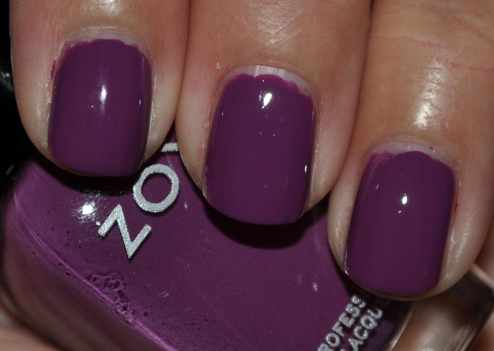
The very last polish in Zoya's Summertime Collection is Mira, and this polish falls into my favorite color category: purple! Zoya describes Mira as a "blue toned medium purple with dusty lavender tones and an opaque cream finish. For a muted yet colorful purple that isn't too dark." This color is gorgeous, and being a purple, I am automatically inclined to love it. This went on nicely in two coats, using Zoya's Anchor base coat and Armor top coat.

For some reason my camera had a hard time capturing this color as well-- the photos make it look a shade too blue and dark.

Artificial light:

Artificial light with flash:

Natural light - shade:

Natural light - shade:

And that's the Zoya Summertime collection!

Thursday, July 14, 2011

Vacation Manicure... what's a girl to do?!

I am going on vacation soon, but I can't decide what to wear on my nails for a week! I wanted something bright and fun and summery-- as well as a color that will work with all the clothes I'll be taking. I was thinking of going for a pink-leaning coral as something that would fit the bill. So I shopped around my stash (and maybe bought a couple of new polishes) to try and find something I liked. And I came up with several possibilities-- but now to make a decision! Here are some of my options (sorry this picture is so terrible):


From left to right: OPI Too Hot Pink To Hold 'Em, OPI Guy Meets Gal-veston, Urban Outfitters Cocktail, and Sally Hansen Coral Fever.

Here they are on the nail (the order is reversed on my hand): 


I used two coats of Coral Fever, three coats of Cocktail, and four coats each of Guy Meets Gal-veston and Too Hot Pink To Hold 'Em.

Coral Fever is a pink-leaning melon coral. I saw this over on All Lacquered Up and it looked a lot more pink-- so much so that I have to wonder if I got a mislabeled bottle. However, I still really like the color and definitely this is as a pedicure color in the future. Cocktail is very pink and very bright. It definitely falls in the coral family, though the pink dominates. This was a little patchy and streaky, even with three coats. With better application, could probably apply just fine in two or three coats. Guy Meets Gal-veston is another member of the coral family, though this is a more reddish pink-- I've heard it referred to as berry coral. This is a "sorbet", so it's very sheer and requires a lot of coats (four) to get rid of most of the visible nail line. Too Hot Pink To Hold 'Em is a very deep hot pink color and is another sorbet like GMG, requiring at least four coats to make it mostly opaque.

I think I like Guy Meets Gal-veston the best (and that was also the one my hubby picked out when I asked his opinion), though they are all pretty. Personally, I actually kind like the gradient manicure, but I don't think I really want to wear that for a week.

Any votes for a particular color?

Zoya Tamsen

The second to last polish in Zoya's Summertime Collection is Zoya Tamsen, described as a "medium warm brick red with strong orange tones with an opaque cream finish.  A special red that is both enticing and mysterious." This was another one of the polishes that I wasn't all that excited about it. Don't get me wrong, I like reds, but in the bottle, Tamsen didn't speak to me. But like Kieko, when I put this on my nails, I really liked it. While this does have orange undertones, it honestly didn't seem as orange (or "rusty") to me as I thought it would. It's not a polish I would wear everyday, but I really do like it.

This was an easy two coater, like the other polishes in this collection. I used Zoya's Anchor base coat and Armor top coat with this.

Artificial light:

Artificial light with flash:

Natural light - shade:

Natural light - sun:

Wednesday, July 13, 2011

Zoya Kieko

Next up in Zoya's Summertime Collection is Zoya Kieko, described as a "warm, red toned dusty light purple with berry tones with an opaque cream finish. A nice alternative to pure pink or berry, especially flattering on warm skin tones." At first, I wasn't sure that I was all that thrilled about Kieko-- it's a pretty color, no doubt, but it wasn't a color I immediately reached for. In fact, I was kind of dragging my feet to try it. But once I put Kieko on, I loved it. It's gorgeous. Like the other polishes in this collection, it's extremely well pigmented and I needed two coats for most fingers, though I did use three coats on a couple of fingers. I used Zoya's Anchor base coat and Armor top coat.

 This polish, while beautiful, was so hard to photograph accurately. Every photo looks different! The artificial light photo is probably the closest in terms of accuracy with the red base, but I love the color in direct sunlight.

Artificial light:

Artificial light with flash (not color accurate at all, too blue):

Natural color - shade:

Natural light - sun:

Seriously in love with this color. Gorgeous!

Tuesday, July 12, 2011

Zoya Breezi

The next polish in Zoya's Summertime Collection is Breezi, a "soft, dusty, dirty medium cerulean blue with an opaque cream finish. A super chic high-fashion denim look for nails." This definitely looks brighter in the bottle than it does on the nail (except for bright sunlight or direct light). Like Zoya's other polishes, this is extremely well pigmented and went on in two coats (I didn't do such a great polish job with this, though, and I apologize). I used Zoya's Anchor base coat and Armor top coat.

Artificial light (the polish looks much darker here):

Artificial light with flash:

Natural light - shade (very shiny and reflection; I'm not really happy with these pictures):

Natural light - sun:

I like the polish best in the sun-- it still has the dusky quality, but is clearly a bright blue.

Sunday, July 10, 2011

China Glaze Broken Hearted

In a quick break from all the Zoya polishes, I decided to break out one of the original China Glaze crackles- Broken Hearted to play with, over Zoya Apple. Broken Hearted is a pink creme crackle. For some reason, I love pink and green together-- something about the combo screams preppy to me. And I love preppy!

This crackle dries matte so I decided to leave off the top coat to see how it looked with the different textures. I rather liked the contrasted between the matte creme pink and the glossy sparkly green.

Artificial light:

Artificial light with flash:

Natural light (shade):

Natural light (sun):