Friday, October 30, 2015

Purple Friday: Colors by Llarowe Rest in Pieces

Another Friday, another week eeking out a Purple Friday post right under the wire. This definitely wasn't my plan. I came down with a very terrible bout of food poisoning (or a stomach virus) on Monday night and spent 7 unpleasant hours getting rid of everything in my body. Not really a great way to spend the night, let me tell you!! I did manage to recover fairly quickly, thank goodness, but it really threw a wrench in my week. I didn't get any Halloween manicures done, didn't feel motivated to post, everything. I'm feeling like a lame-duck blogger right now, but oh well.

Tomorrow is Halloween night and a black out game at Husky Stadium. Due the late start time (8pm, are you kidding me?) and the holiday it's practically impossible to find a babysitter. So I'm staying home and watching from the couch while my husband attends. Which actually suits me ok, because now I don't have to deal with rainy weather or getting home at 1am. We're playing Arizona, and in the past some of these games have been pretty crazy-- so I might miss something. But I'll take that chance.

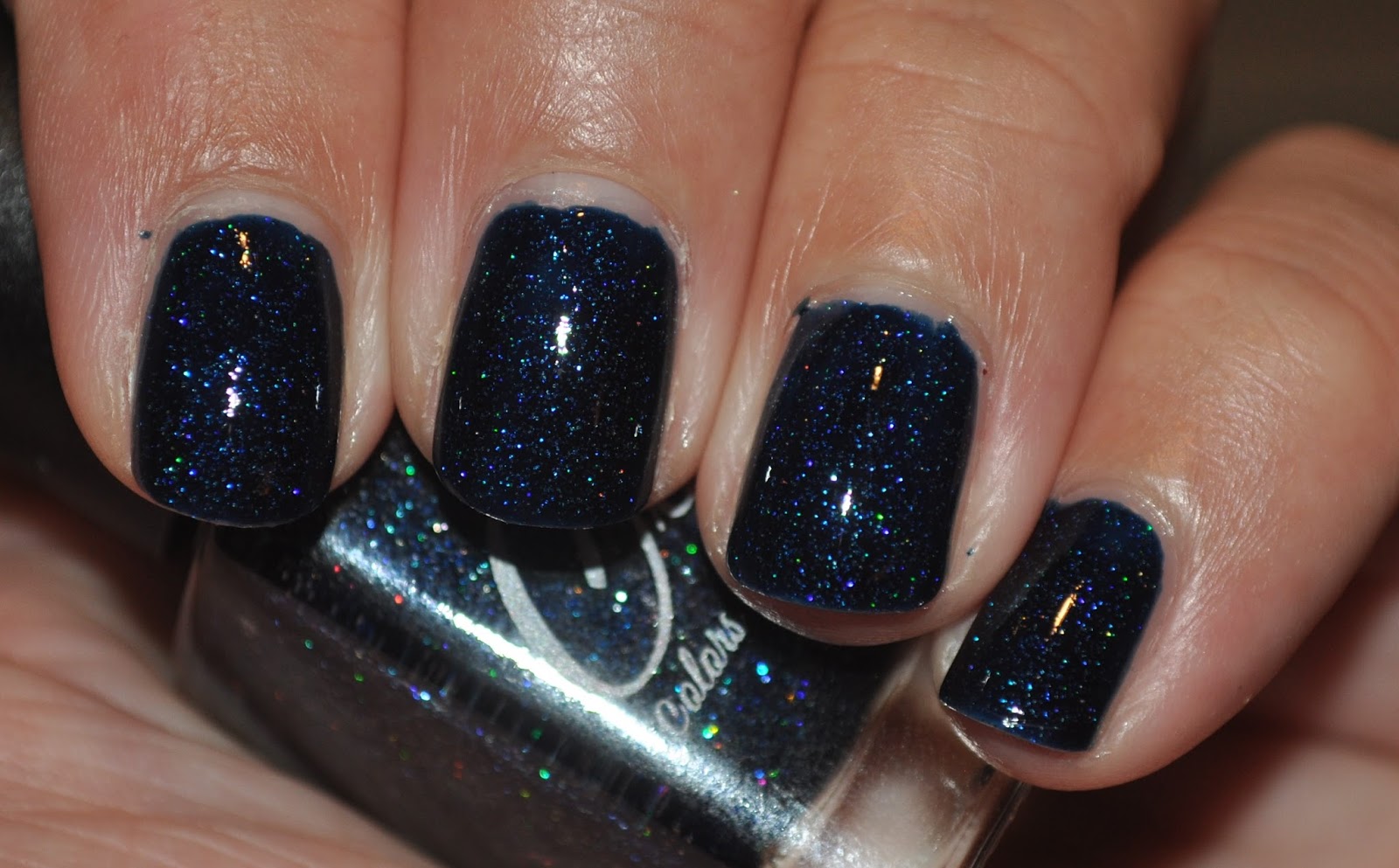
When I realized there was going to be a Halloween night game, I immediately thought of Colors by Llarowe Rest in Pieces, which is a polish from the New Year, New CbL collection. It's described as a "deep purple linear holo with blurple holographic micro shimmer." The formula is pretty good-- it was just a teensy bit streaky in the first coat, but two coats gave me perfect coverage. It dried down quickly and with a shiny top coat, looks gorgeous. My photos show it as a blue leaning purple, but in real life in has more red tones. I might try to snap some pictures in natural light to see if I can get a more accurate color shot.

Artificial light (flash):


This polish is perfect for Halloween night-- deep and vampy with the holo sparkle. It's moody and mysterious. The formula was great and even though it's a shame I waited so long to wear it, I think I'm putting it to good use now! And with that-- I'm beat!

Go Dawgs! Beat the Wildcats!

Tuesday, October 27, 2015

Two-fer Tuesday Colors by Llarowe Living the Dream and Mango Bunny Christmas in July

Let's get ready for another edition of Two-fer Tuesday! Today I have two polishes from this past summer, coincidentally from July. And it's now... October. Yeah yeah. Bring on the polish! Today I have two sparkly holographic dark blue polishes. The first is Colors by Llarowe Living the Dream, which is from the 4th of July trio. It is a dark navy blue with a large, scattered holographic finish. Then I have Mango Bunny Christmas in July which is a slightly lighter dark blue with a more linear holographic finish.

I think I used two coats of each of these-- Living the Dream was a little bit sheer in the first coat but by two coats was opaque. I can't remember for Christmas in July-- sorry! I wasn't in love with formula; it seemed like there were a few lumps like it wasn't mixed all the way, but that might have been something on the brush that I picked up from my house. Otherwise it went on smoothly. Living the Dream is a slight deeper blue. 

Colors by Llarowe Living the Dream:


Mango Bunny Christmas in July:


These polishes are not the same, but they are both very pretty! I think Living the Dream slightly edges out Christmas in July, just because I feel like the holographic sparkle was more visible, while the dark base of Christmas in July did swamp out the linear finish, just a bit. Overall, I also liked the formula of Living the Dream more. Unfortunately, neither of these polishes are currently available but there are other dark blue holographic polishes out there-- happy searching!

Friday, October 23, 2015

Purple Friday: Cover Girl 300 and Wet n Wild Happy Hour Hop

Hey all!! We're back at Friday, woo! I feel like I did not get much of a weekend last week, probably because I didn't get near enough sleep. Hopefully this weekend will-- helped by the fact that the Huskies have an away game this week. They are down in the Bay Area, playing Stanford. It was a tough (and close) loss to Oregon last week and this week will be an even bigger challenge. I don't really expect a win, though you never know, right? I also didn't expect us to beat USC and that happened. Maybe something equally miraculous will happen this week! (Fingers crossed.) But despite my lack of optimism, of course I will supporting my Dawgs. I was debating about what polish I wanted to wear. Initially I thought I wanted to wear Wet n Wild Happy Hour Hop, which is a dusty medium purple loaded with gold flakies, but it ended up being more sheer than I wanted, so I cast around for a purple polish to layer it over and settled on CoverGirl 300 (boo numbered only polishes), which I received in my Christmas stocking last year. 

CoverGirl 300 is a blue-leaning grape purple creme, which was a little on the thin side and wanted to streak. I used two coats here, though the second coat was pretty thick. It seem to do the trick, though! Then I layered one coat of WnW Happy Hour Hop on top of it. Confession: I did buy my bottle of Happy Hour Hop from eBay, and while the swatches I have seen online seem to indicate that HHH was more opaque, but mine was definitely not. When I initially swatched it, I did have longer nails, so maybe it's better on shorter nails.

CoverGirl 300:


My photos make this appear brighter than it is in real life. It's 

Wet n Wild Happy Hour Hop:


 You can see that HHH does leave some visible nail line. It's not terrible, but it's also not my favorite. I don't know if something was done to the bottle I purchased, but it is what it is. I could have worn this alone

Wet n Wild Happy Hour Hop over CG 300:


Because HHH is on the sheer side, the finished product does take on a more blue-leaning aspect thanks to the base color, but again, these photos are brighter than it actually appears in real life. I really love the gold flakies in the purple base. It's soooooo pretty. Next time I might try to find a base color that is slightly closer to the base of Happy Hour Hop, but it looks great regardless.

Go Dawgs! Beat the Cardinals!

Thursday, October 22, 2015

Colors by Llarowe Ice Chip Wishes and Epidural Dreams

It's almost the weekend! Hooray! Today I have a polish with a mouthful of a name to show you. Colors by Llarowe Ice Chip Wishes and Epidural Dreams is a polish from the Oh, Baby collection that was released last spring (and sadly no longer available, sorry!!). The name is a mouthful, to be sure, but given that this whole collection was named by a mother who had just given birth, I think it's hilarious. Now that I've given birth, I find this name hilarious. Spot on. In theme with the name, Ice Chip Wishes and Epidural Dreams is an icy, pale blue polish with a strong linear holographic polish.

Like most  CbL polishes, this one has a great formula. Thick in a good way, this could probably be a one coat wonder. I am pretty sure I used two coats here (I never leave any polish at just one coat). It dried quickly and didn't drag-- and it looks fabulous. The strong linear finish doesn't overwhelm the blue base, which is my pet peeve with pale linear holographic polishes. Because of the pale color, it does lean slightly silver, but you can still see the blue.

Artificial light (flash):


Ice Chip Wishes and Epidural Dreams is a gorgeous color-- this icy blue is one that works for both winter and spring. The name cracks me up and the formula is fantastic. I'm just sorry I'm showing it to you long after it's sold out; my apologies!

Wednesday, October 21, 2015

Julep Suse

For some reason I though I had already written a post on this polish but I guess I didn't! Whoops. Julep Suse is described as a "coral blaze creme" and that description is spot on. I've had this swatch sitting around for awhile-- I actually think Suse was released in the June "The Deep End" Maven collection. Of course, in June, a coral creme was the perfect way to get summer started. Now it's October (and we're already in the second half, noooooo) so it's not really seasonally appropriate anymore. But I feel that you can wear whatever colors you want whenever you want, so who cares!!

As a polish,  I find the color of Suse to be great and perfect for summer. However, I did find the formula left a little bit to desired. It's not terrible, mostly just okay. It was a little thick (which might have been aggravated by the hot, humid weather we were having when I swatched this) but was also streaky, which is highly annoying. It wasn't so terrible that I was exceptionally bothered by it, just mildly annoyed. The fact that it's my favorite summer color makes up for a lot, haha!

Artificial light (flash):


It's not quite the color of the season, but still a very pretty color! It was a little bit streaky but not too terrible-- I don't think it's very visible in real life. I wish it was a bit better, but overall I still like it! Hopefully this bright little coral brightened your Hump Day!

Monday, October 19, 2015

Sinful Colors S-cool

Let's get the week started off right! Today I have Sinful Colors S-cool from their fall collection to show you! Sinful Colors had a huge fall collection that was broken into several smaller ones. S-cool is from the Play It Cool group. At first I passed this one by, but after seeing some swatches, I decided I needed to have this one (along with a few others). I love anything blue, so it probably won't come as shock that I love this one.

S-cool is a light turquoise-leaning sky blue creme. It's bright, but not too bright. And even better, the formula on this is fantastic. You can't really ask for anything more from a polish that costs $1.99! It went on smoothly and without issue. I used two coats here (I'm pretty sure) but I definitely don't recall having issues. I love it when a polish hits a home run like this: great color, great formula, great price!

Artificial light (flash):


S-cool is so gorgeous! I love this polish. Great formula, great color. The only problem is the fact that this wants to stain upon removal. Not necessarily your nails, though I would probably double up on base coat. This definitely will stain your cuticles-- Smurf city. Annoying, so just be careful upon removal! Otherwise, though, I have no complaints! Happy Monday all!

Friday, October 16, 2015

Purple Friday: OPI Do You Have This Color in Stockholm and Zoya Gilty

Not going to lie, I took the lazy route out this week and modified my manicure from last week. And speaking of lazy, I totally forgot to write up this post before Friday and schedule it! Ugh, sorry! I don't know how it slipped my mind, but I totally forgot. One of those weeks! Let's get to the post!! This week the Huskies play Oregon, one of our most better rivals. The last time we beat Oregon was 2003... 11 years ago!! So long ago my husband and I looked like this:


OMG BABIES!! Where are these people now?! Hahaha, anyway... we hate Oregon. For a variety of reasons, but now mostly because they have beat us 11 times in a row and seriously, could we just freaking beat them already? Oregon is floundering right now, so there's hope for us. I mean, we did beat USC last week! That was a pretty amazing game.

As for manicure, we were out of town last weekend and I decided that I didn't have to time to come up with something super unique. So I pulled out OPI Do You Have This Color in Stockholm?, which is still an amazing purple (and I feel like I've got a handle on applying it now) and then pulled out Zoya Gilty, which is an 18K gold topper that I've had for at least two years. I have too many polishes (haha said no nail polish addict ever). I did have to do some fishing for the flakes, and definitely had to dab them on my nails. My photos are a bit sparse-- the actual manicure I ended up with has a bit more as I got better at getting the gold out.

Artificial light (flash):


Personally, I think the purple and gold combination looks incredibly royal! The gold flakes really pop against the purple base. It was a little annoying to get the gold flakes out of the bottle, but worth it for the final look.

Go Dawgs! Beat the Ducks!

Tuesday, October 13, 2015

Pink To Black manicure

Hi all! I have a slightly different post to share with you today. I usually don't use my blog as a soap box, because in general I consider nail polish and blogging to be my hobby and I tend to keep things happy and upbeat because this is one of my escapes. However, this is the month of October, which we are all aware is when we are inundated with advertisements and campaigns urging us to support breast cancer awareness, in addition to an overload of pink items. The sad fact is, though, that while we are all aware of breast cancer these days, there is still a lack of funding for real, hard research that finds ways to cure breast cancer (or any cancer, really, but October focuses on breast cancer).

I have a friend who is dying of metastatic breast cancer. She is 39 years old (only seven years older than I am!) and has two children and a husband she will leave behind when her disease inevitably kills her, unless a cure is found. And that cure comes from research, bench science, clinical trials-- not awareness campaigns. My friend founded an organization called METUP, which is an activism organization that is bringing attention to those living with metastatic breast cancer and to campaign for more funding to be directed to research for a cure. Today they are staging a die-in in Washington DC and I wanted to create a manicure in solidary. The METUP logo is the ubiquitous pink ribbon, but you come to the ends, the ribbon becomes tattered and fades to black.


This logo inspired my manicure idea-- to create a pink to black gradient on my nails. For this manicure I used Colors by Llarowe Engorgeous, Fancy Lacquer Come To The Dark Side, and Colors by Llarowe Luke, I am Your Father. I painted two coats of Engorgeous, and then I sponged on Come To The Dark Side and Luke, I am Your Father. The last one proved to be a bit sheer while I was trying to sponge it on, so I ended up painting a stripe of it on the free edge of my nail, then sponging more grey and black on top of it to create the the gradient effect.

Artificial light (flash):


I'm really happy with how this turned out and I definitely managed to to capture the idea I had in my mind. I think the grey helped ease the transition from the pink to black.

So, while I feel that whatever causes you choose to support are your own business and you should never feel coerced to give money where you don't want to, if you are motivated to give to a breast cancer charity this month, I would encourage you to donate to one of the charities listed here to give to groups that support breast cancer research, especially metastatic breast cancer instead of just awareness campaigns.

Note: I am in no affiliated with any of the organizations I have mentioned/linked in this post-- I am merely promoting a cause I feel deserves the attention.

Thursday, October 8, 2015

Purple Thursday: OPI Do You Have This Color in Stockholm?

And for another switch up, we're having a Purple Friday on Thursday! The Huskies are playing tonight down in LA against the USC Trojans (and former coach) so of course it's a big game! And of course I have a purple mani to show you! It's a Husky game day! I'm not super optimistic about the game, but am hoping we play well and maybe, just maybe, pull out a win. That would be amazing!

This week I decided to go with a classic purple creme, mainly because I'm lazy and wanted something quick, but also because it's well, really, it's a classic! So is the UW-USC rivalry and we've had some awesome (and heart-breaking) games. So I grabbed a polish from the company that started my nail polish addiction: OPI. This is Do You Have This Color in Stockholm? and was released as a part of the 2014 F/W collection. This polish, which has an insanely long name, is a deep right purple with blue tones. The color is incredible. However... the formula leaves a lot to be desired. It's decently pigmented, but it's thin and watery and so goes on very streaky. Womp womp. It's workable, just not would I would have hoped for. I used three coats here and I would recommend using a light hand to avoid dragging and creating more streaks. I basically tried to "float" the third coat on there to make sure I got rid of all the streaks, because there were still there after two coats. On the upside, it did dry down quickly and does dry to a shiny finish (I'm not wearing a top coat here).

Artificial light (flash):


I wasn't thrilled with these photos with my photos-- you can tell it's purple, but it looks a little washed out. So I took a couple photos with my iPhone-- they're not great quality, but I think the color looks a lot closer to real life.


So that's it for this week! The color is fabulous, but the formula left a lot to be desired. Which is a shame, because I expect more from OPI in general and they generally deliver. Bummer! But... I'm willing to forgive them because this is a pretty fabulous purple. And so with that, I'm signing out!

Go Dawgs! Beat the Trojans!

Wednesday, October 7, 2015

Colors by Llarowe Believe in Miracles

Ugh, I have been battling a cold and it's no fun. I hate colds! My nose has been running like a faucet and my sinus ache. Over it! I originally planned on doing some swatching over the weekend but was feeling way too miserable to attempt it. But I did get some blog posts written! Today I have a truly stunning polish to share with you-- Colors by Llarowe Believe in Miracles. CbL has started a new series of polishes for each month, releasing on the first day of the month and are available on that day only. I actually missed this when it was released on the Llarowe website and managed to snag it off the Harlow & Co website-- so if you miss a release you may be able to get it through a distributor!

Believe in Miracles is a gorgeous deep teal holographic polish. It does have a slight linear aspect to it, but overall has a scattered appearance that gives it a lot of depth. It's hard not to be captivated by this-- I feel like this is a perfect mermaid polish. Believe in Miracles had a great formula; went on smoothly and easily and I used two coats here. Siiiigh, isn't this dreamy?

Artificial light (flash):


Believe in Miracles is so gorgeous. I got several compliments on her, which is always helps give a polish a high mark-- if someone else comments on it, you know it makes a statement. Definitely a winner, and I'm someone who doesn't usually go for greens and teals. I'm really glad I picked this up!

Tuesday, October 6, 2015

Fairytale Finish August 2015 Neverending Fairytales Box

I'm running so behind, as per usual. I keep thinking maybe I'll catch up, but hahahhaha I think we all know the truth. Maybe if I could take a week long vacation with my kids and my husband. ;-) Not likely! This week I have the July Neverending Fairytales Box from Fairytale Finish. This box had the theme of "baked goods" so the two polishes are inspired by that! There was also a fun little mani bomb included that was lemon cake scented and it smelled so good I wanted to eat it (I did not, though, don't worry!).

First up we have Triple Berry Tart, which is a hot pink crelly with a mix of blue and white glitters and a fine shimmer to it. It applied pretty well, though I did feel like the glitters were a little more sparse when I applied it (though it doesn't look like it in my pictures, so I think I'm just a little crazy). I mostly applied this like I would a non-glitter polish, though I done a little bit of dabbing to make sure the glitters were where I wanted them. I used three coats here, just to make sure I want the coverage I wanted. I probably could have gotten away with two!

Triple Berry Tart:


For some reason, this photographed a lot brighter and more red/orange than pink. You can clearly see that the bottle has a much pinker base, and that is what it looks like in life.

Next up we have Choc Full of Holo, which, if you can't from the name, is a chocolate holographic! It's a cooler leaning brown, and really gorgeous. The holo is linear, but not particularly strong. It does give it a really nice sparkle, though! I wore this polish for several days, though I felt like I needed to wait until fall to do so because brown just does not read summer to me. Sorry, brown, but it's true. It looked great and held up really well.

Choc Full of Holo:


Another great box from Amanda and Fairytale Finish! As per usual the polishes were awesome, and the packaging was great (though I never manage to get a picture of it). I have really been enjoying this subscription box! Hopefully I'll get a review of September's box up soon, though we'll see if that actually happens! Will I catch up? Tune in to find out!

Monday, October 5, 2015

Seahawks Monday

Woo, a slight change of pace this week! The Seahawks play the Detroit Lions this week for Monday Night Football. With the Huskies having a bye week I actually painted my nails for the game! So I thought I'd shake things up with my regular posting schedule and share my manicure. I was sick last week and into this week but am finally starting to feel a bit more like myself, so I squeezing in this post before bedtime-- I just finished applying this to my nails! Fresh of the presses, literally!

This week I picked another one of my Seahawks themed polishes-- this time, Sea, from Daily Hues Nail Lacquer. This is part of a duo-- I've actually shown you the other polish, Hawks, previously. Sea, as the name might suggest even if you weren't a Seahawks fan, is an ocean blue holographic. Sea has a jelly-like consistency and is on the sheer side. I used three coats here and it's still a bit sheer for my taste. But I didn't use undies and I didn't want to do another coat so here we are! With the jelly like formula, I did have to be a bit careful with my application and use a light hand to avoid dragging it. The linear finish is linear, though it isn't an extremely strong linear. It does have a very nice sparkle, though!

Artificial light (flash):


I like Sea, though I wish it were a little more opaque. However, with the color, name and jelly like finish, I can almost imagine this as a piece of seaglass, so I'll live with the sheerness.

Go Hawks!