Wednesday, September 7, 2011

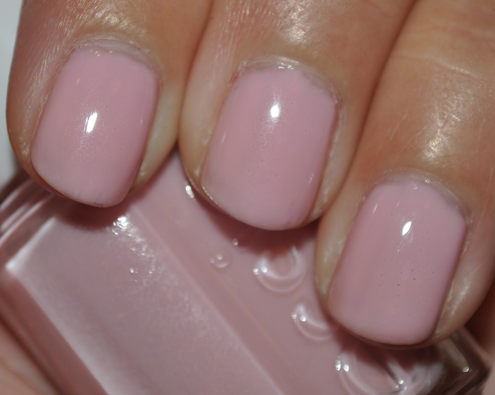
Essie Better Together

The next several posts will look at Essie's 2011 Wedding Collection. I decided to pick up this collection on a whim when I was in a major polish hoarder phase-- but it works because I've got two weddings upcoming! (Well, one is in October of 2012, but it's my sister-in-law's, so it's a big deal!) So I'm reviewing this collection for any potential brides out there... but stay tuned for next summer/fall when I will be putting together some ideas for my SIL's big day.

First up is Better Together. From what I can tell, this is a pretty classic sheer bridal pink, meant to worn to give the nails a little bit of color or as part of a french manicure. This color can be made opaque, but I needed four thickish coats to get there.

Artificial light:

Artificial light with flash:

Natural light - shade:

Natural light - sun:

As you can see, it's a very pretty color-- reminiscent of ballerinas, in addition to brides. Sweet and simple. But the fact that it's sheer and takes at least four coats to make opaque is a huge turn-off, at least for me personally. The color isn't original and unique enough to warrant the extra effort. You can find pretty, light pinks that are opaque in fewer coats. However, in addition to needing many coats for this one, I also had a lot of issues with bubbling with Better Together. Not sure if that's because I used thicker coats or just the nature of this particular polish. I used Essie First Base base coat and Good to Go top coat. For some reason I also got some bubbles in the top coat, which is something I don't run into often with this top coat.

My verdict: while it's a pretty color, I think that unless you're specifically looking for a sheer pink polish, you can find a similar color that's opaque and less problematic.

Tuesday, September 6, 2011

Zoya Touch Collection Review

Zoya's Touch Collection: a set of three neutral polishes went to compliment the tones in your skin, depending on whether you are warm, cool, or neutral-- rather than matching actual skin tone. All are supposed to be "full coverage" neutrals-- meaning opaque and not sheer. In addition, all the polishes have a slight silver shimmer to give them some pop.

Minka is a yellow-ish beige neutral, meant to compliment those with neutral or olive tones to their skin.

Shay is a peachy-beige neutral, meant for those with warm skin tones.

Pandora is a pink-tinged beige neutral, meant for those with cooler skin tones.

While I feel that Shay was the most flattering on me personally, but I thought the whole collection was really nice and could work for a wide range of people. I feel like I could wear any of these colors if I wanted to. I was originally afraid that the silver shimmer would make the polishes look too frosty and old fashioned, but that isn't the case at all. The shimmer is very subtle; just enough to keep the polish from being a plain creme.

Now, as you can see from the pictures, I had some issues with bubbling when I used Minka and Shay (particularly with Shay, for some reason). This is not the first time I've had issues with this using Zoya polishes. However, I am inclined to say that this is not necessarily due to the fault of polish, but Zoya's Color Lock System (their base coat, top coat, etc). Several other times when I have used Zoya's system, I would have absolutely no bubbles until I applied the top coat and then bam! bubbles. It's extremely aggravating when you do a a great manicure and then you get ugly bubbles. Argh!! I've tried several things to try and avoid this-- using thin coats of polish and waiting for upwards of five minutes between coats-- and still I had bubbles. So I decided to scrap the Color Lock System and use my go-to base/top coats from Essie, which I have used here with Pandora. And look, no bubbles!

From searching the internet, it seems that there are a lot of other people out there who have had this problem. One recommendation is to add thinner to either (or both) Zoya's base and top coats. I have not had an opportunity to try this yet, so I'm not sure if that will work. I will let you know when I try it. But right now I am finding that using another base/top coat combination is working a lot better for me and my Zoya polishes still look great. A lot of people out there believe that body chemistry can affect how polish goes on your nail, so it may also be a case of Zoya's system not working well on me due to that. In any case, I think I'm going stop using the Color Lock System for now.

So overall, the Touch Collection gets a thumbs up and the Color Lock System is currently getting a thumbs down, unfortunately.

Monday, September 5, 2011

Zoya Pandora

And the last polish of Zoya's Touch collection is Pandora. This polish is much more pink than either Minka or Shay. Zoya describes Pandora as "a medium pink-beige nude with blue and mauve undertones and a hint of pearly silver shimmer. An opaque, full-coverage nude that works beautifully on skin with cool tones." I felt like I had the easiest time with this polish-- I managed to get good coverage with two coats without out any issues.

While I do think this color is a little too pink and a little too dark to work as "nude" for my skintone, it still works as a good neutral polish. Unfortunately, I feel like my camera didn't really pick up the pink tones of Pandora very well. In some of the pictures you can see it, but the polish is a lot pinker in real life.

Artificial light:

Artificial light with flash:

Natural light - shade:

Natural light - sun:

Sunday, September 4, 2011

Zoya Shay

The second polish from Zoya's Touch collection is Shay. Zoya describes Shay as a "dense, fleshy light peach with slight orange-red undertones and a hint of pearly silver shimmer. An opaque, full-coverage nude that compliments warm skin tones." I found that I much better luck working with Shay than I did with Minka-- I was able to get this fully opaque in two coats and didn't have as many streaking issues. Also, this more peachy beige color definitely suits my skin tone better than Minka did. I actually just wore this to my godson's week baptism a week ago-- it's a great neutral polish and is very flattering and chic.

Artificial light:

Artificial light with flash:

Natural light - shade:

Natural light - sun:

As you can see, I had some issues with bubbling when I originally wore this polish and I'll get to talking more about that when I do my wrap-up post on the Touch collection. Needless to say, this polish applies very well and it's not the polish that is the problem.

Friday, September 2, 2011

Football Friday: butter LONDON No More Waity, Katie

Welcome to my new weekly feature: Football Friday!! One thing that is essential to know about me is that I am HUGE college football fan. I grew up watching Michigan football with my father and as an alumnus of the University of Washington (where I was a member of the marching band) I still follow/watch the sport avidly. Saturdays in fall are sacred! Nothing beats a good game. My husband and I just bought our first season football tickets this year and so I've decided to make a weekly feature on the blog where every Friday I will post my manicure for Saturday's game. Since UW's colors are purple and gold, expect to see a lot of that. I am also hoping that this might give me the chance to explore some fun combos and even try my hand at something more "artistic", though I'm not quite sure how that will work out.

For my first football manicure, I decided to pull out butter LONDON's No More Waity, Katie. You can probably guess from the name, but this polish is an homage to the royal wedding this past spring. It was originally released as a limited edition polish and sold out rather quickly, but butter LONDON decided to re-release No More Waity, Katie as part of their Fall/Winter 2011 collection. As a note about butter LONDON, the founding creative director, Nonie Creme, is British, but the business has it's flagship store in Seattle, making this a location business for me! No More Waity, Katie is described as an "soft, elegant greige shade with a splash of lilac glitter is the perfect marriage to combine fashion and fun."

This shade is gorgeous. Definitely. I've got about a thousand pictures of it (not really, but darn close). The only problem with No More Waity, Katie is that it's sheer. Really sheer. The glitter is suspended in a sheer dark purple base. I put on the first coat and had to take if off almost immediately. I could have taken the time to build it up so it was opaque, but I was lazy and didn't feel up to it. So I pulled out Zoya Caitlin, which is a creme that is similar in color as a base (I'll post on that later). That was much, much better and so I then layered two coats of No More Waity, Katie over Catilin. Success all around!

Artificial light:


Artificial light with flash:

Natural light - shade:


Natural light - sun:

This is a little on the softer side (which is pretty much the exact opposite of the way I am with football), but I think the glitter spruces it up. Plus, it's really pretty. Week 1 of Football Friday, done!

Thursday, September 1, 2011

Zoya Minka

This summer, in addition to their colorful collections, Zoya also released a set of three "nude" neutral polishes that they call their Touch Collection. All of these are nude cremes with a hint of shimmer and they are suppose to cover in I believe, 1-2 coats. Zoya promotes them as "full coverage".  These colors are not meant to match skin tone, but more the undertones of your skin-- whether they are warm, cool, or neutral. At some point during the summer I picked up the trio of polishes but only got around to trying them out recently. First up is Minka!

Zoya describes Minka as "a pale, milky beige nude with yellow undertones and a hint of pearly silver shimmer. An opaque, full-coverage nude, especially flattering on skin with neutral and olive tones." Personally, I had issues with Minka-- it seemed very streaky to me and I needed 2-3 coats to get rid of patchiness and even it out. A lighter touch might have helped.

In the end, I didn't mind Minka, but I don't think the coloring was particularly flattering with my skin tone. I definitely don't have olive tones in my skin, and while I did like in some lights, I definitely don't think this is the right neutral for me. I did like that the shimmer wasn't too apparent-- I was a little afraid these polishes would fall more on the pearly side. It was just enough to make it interesting, but not overpowering.

Artificial light:

Artificial light with flash:

Natural light - shade:

Artificial light - sun:

Tuesday, August 30, 2011

Cult Nails Captivated

Cults Nails is a brand that is fairly new to the world of nail polish and what's so awesome about it is that was created by a nail polish blogger, Maria Morrison, over at R3 Daily. In addition, they are Big 3 Free and vegan friendly. Pretty cool, huh? Maria also seems really nice and down-to-earth (though I have never had the pleasure of meeting her) and she interacts with her fans a lot over Facebook and Twitter, which is great because we get sneak peeks into future colors of her line and get to see some of her creative processing. Additionally, I suspect a lot of us envy Maria (in a nice way!)-- because we all dream of colors we'd like to create but probably never will. This is my first review of a Cult Nails polish-- but I am lucky to have all of them, so you can look forward to many more reviews in the future.

Captivated is a polish is from Cult Nails Spring/Summer 2011 collection, Day at the Races. It's a sheer coral jelly polish that is absolutely packed with gold and coral glitter. Really blingtastic. The polish itself is a little thick, but not unworkable. Here I used Captivated over OPI's Mod-ern Girl. Considering that they are both corals, I thought it would work out well. However, the finished product ended up looking much more orange, but still really pretty.

A plethora of pictures await!

Artificial light:

Artificial light with flash:

Natural light - shade:

Natural light - sun:

Blurry because I think it's pretty:

Unfortunately, Captivated was a limited edition polish and is sold out, with no plans for its return. But, Cult Nails is having a sale this weekend in celebration of Labor Day and you can get 2 polishes for $15! Cult Nail polishes usually retail for $10.

Monday, August 29, 2011

OPI Mod-ern Girl

I saw this polish randomly at my local Ulta store and decided to snag it because it was a polish I hadn't seen before (at least in person). Mod-ern Girl was released as a part of OPI's Summer 2008 Mod About Brights collection. Mod-ern Girl is a red-leaning coral polish, though if you look at OPI website, they show it as a strainght-up orange polish. It is most definitely not just an orange polish-- it changes in the light so sometimes it looks very orange and sometimes it looks more red/coral.

What I didn't realize is that Mod-ern Girl is a jelly polish and pretty darn sheer. I used four coats to eliminate most of the visible nail line. It's a really fun polish-- very bright and definitely "on" for summer. I just wish it was more opaque. I used Essie's First Base base coat and Good to Go top coat. This post includes a few more pictures than normal, just so you can get a sense for how the polish changes.

Artificial light:


Artificial light with flash:

Natural light - shade:


Natural light - sun:

Friday, August 26, 2011

Preview of butter LONDON No More Waity, Katie.

Here I have a quick preview of one of butter LONDON's Fall/Winter 2011 polishes No More Waity, Katie. I was going to include this in yesterday's post but was feeling tired and so I didn't get around to it. While I was wearing Sally Hansen's Delphinium, I decided to break out No More Waity, Katie for an accent nail. I thought the glitter in No More Waity, Katie would match the base color of Delphinium. It's not an exact match, but I think they pretty nice together. I'll be doing a full review later on, probably when football season starts, since this is such a pretty purple. 

Artificial light:

Artificial light with flash:

Natural light - shade:

Natural light - weak sun:

Thursday, August 25, 2011

Sally Hansen Delphinium

Delphinium is another polish from the Tracy Reese for Sally Hansen Spring 2011 collection. Being a purple addict, I had to get this one. It's a very creamy pale lilac color and I thought I would love it.

For reference, here are what delphiniums (the flower the polish was named after) actually look like:

You'll see that the polish clearly doesn't match any of the colors in this picture exactly, but it fits in to the overall scheme.

Overall, I felt Delphinium had a much better formula than Coral Fever did. It went on smoothly and I used three coats. Maybe it was because I had just used another Sally Hansen and was more used to the brush, because this seemed a lot easier to work with in the end.

Artificial light:

Artificial light with flash:

Natural light - shade:

Natural light - sun:

Looks nice, right? Well... I didn't really like it at all. This color seemed old to me and gave me old lady hands. I like how it looks in the sun, but I wasn't overly wowed by this color. Quite honestly, I almost think this polish works as a neutral. Hear me out! Yes, it is a purple polish, but it's a very "quiet" color. It doesn't really pop and just kind of subsides in the background. So for me, this was kind of a dud. Not because it's quiet, but because I just wasn't in love with the color.