Wednesday, August 24, 2011

Sally Hansen Coral Fever

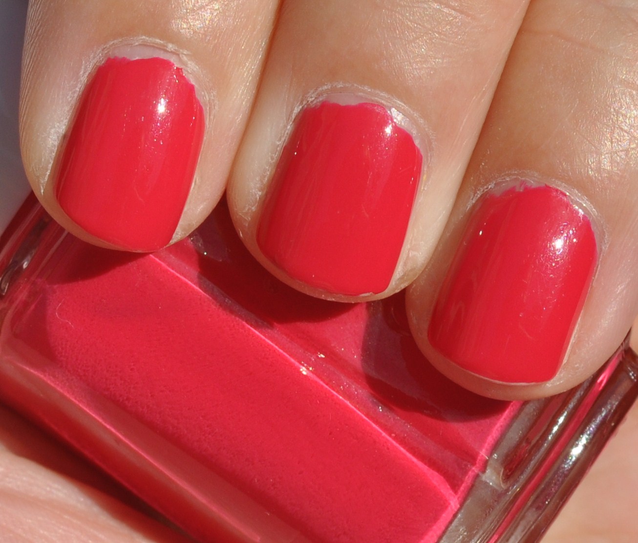
Coral Fever is one of the polishes from the Tracy Reese for Sally Hansen Spring 2011 Collection. You saw this briefly in an earlier post, but since summer is such a fantastic time for corals, there was no I could let this languish in one of my polish drawers. Coral Fever is pink leaning coral. Or so I thought. This color is actually very hard to describe and capture-- maybe because it's basically balanced so well between orange and pink. I originally saw a review of Coral Fever over at All Lacquered Up and loved it-- it looked a little more pink and was super bright. Fast forward to breaking into my own bottle, and my version of Coral Fever looks a lot more orange. I was a little disappointed because I was expecting it be slightly more pink. However, despite my initial disappointment, it's still a great shade of coral.

My only other complaint is about the formula. Prior to this, I had only tried Sally Hansen's Gray by Gray, which had a really nice formula and I loved the wide brush, which is great for my wide nail beds. However, I felt very frustrated by the formula of Coral Fever. It seemed thick and I had trouble getting it to even out. I got away with three coats in the end and it looks ok, but I remember feeling very frustrated at the end of my manicure.

Artificial light:

Artificial light with flash:

Natural light - shade:

Natural light - sun:

As you can see, the color changes depending on the light. Sometimes it looks more pink (or even reddish) and other times more orange.

Tuesday, August 23, 2011

Julep Maven Program

The Julep Nail Parlor is a local Seattle business and they have recently started a new program for all the "beauty mavens" out there.


For $19.99 a month you get over $40 worth of Julep beauty products, including nail polish, treatments and other beauty products. Since this is a new program, there are lot of beauty bloggers with codes for half-off your first box.You also get 20% off all Julep products and free shipping on anything you buy. In addition, you can skip a month or choose to send a month to a friend, which is cool.

The first thing you have to do is head over to Julep's website and take their Style Quiz and find out which kind of maven you are. I got American Beauty, but there several other options, including Boho Glam, Classic (With a Twist), It Girl, and Bombshell.

Here's this month's box:


This month I got Alfre, a shimmery grey-purple from Julep's yet to be released fall collection and Cameron, an energetic, summer pink (so says Julep's website). I also got some of Julep's base coat. Julep's nail polishes and treatments range from $14-16 each.


I also got a full tube of Julep's Glycolic Hand Scrub to use! Awesome! This sells for $32.


All in all, not bad for $19.99 (and I had a half-off code, so really $10!). We'll see what happens with next month's box, which only includes one nail polish but some other cool goodies.

Essie Watermelon (and my last vacation manicure)

In a break from all the collections I've been showing you, I'm going to show you another one of the $1 Essie polishes I managed to snag from the Trade Secret near my parent's house in Portland. At the beginning of August we went on our annual Not Quite Camping Weekend with our friends-- which is basically an excuse to lay in the sun, swim, eat, drink and play games for a weekend. It's fabulous. Anyway... to celebrate the last vacation of the summer I decided to go with a nice pink and something quintessentially summer: Essie's Watermelon.

Watermelon is a deep blue-leaning pink. In the bottle, this pretty much looks like the inside of a watermelon. On the nail, however, I was a bit disappointed. Mainly because the polish on the nail does not reflect the color in the bottle, which was a major bummer. To me, this polish looked a lot more red instead of pink in most lights. This applied really smoothly, though I used three coats in total with Essie's First Base base coat and Good to Go top coat.

Artificial light with flash:

Artificial/natural light:

Natural light - shade:

Natural light - sun:


Monday, August 22, 2011

American Apparel Neon Collection Review

Sorry for the delay in posting-- my in-laws were visiting and even though they are very easy house guests, I didn't have a minute to spare for posting. Now that I've made it through all of the American Apparel neon polishes, I have a review/wrap-up post!

A rainbow of neon!!


These polishes are extremely bright and a lot of fun. However, the formula varies quite a bit from polish to polish. Neon Red, Neon Blue, and Neon Violet had the best and easiest formulas to work with of all the polishes, while the others tended to be streaky and need several coats (3-4) to even everything out and get rid of any patchiness. However, this may in part be to due to the fact that these three are less "neon" than the other four-- they are still very bright, but not quite as bright. Neon Blue, in particular, did not seem as neon as the other polishes.

Neon Red: 

Neon Coral: 

Neon Orange:

Neon Yellow: 

Neon Green:

Neon Blue: 

Neon Violet: 

I thought of all these polishes were a lot fun, despite the formula issues. My favorites were Neon Violet (despite the color inaccuracies of the photos), Neon Coral and then honestly it's probably a tie between Neon Orange/Neon Yellow/Neon Green. They're all great. $6 a piece, and they're available online at American Apparel.

Friday, August 19, 2011

American Apparel Neon Blue

And we've reached our last polish in American Apparel's neon collection. Neon Blue was added to this collection after the first six were released and I stumbled across this in June when I was shopping for a top for my father-in-law's 60th birthday. Happy day!

The formula on this polish was pretty good, similar to Neon Violet and Neon Red. It covered fairly well, but it was a little streaky. Three coats evened it all out. My one quibble is that this didn't really seem neon. It certainly is bright, but isn't exactly neon. And the blue is slightly darker than what you see in my pictures-- it looks lighter here.

Artificial light:

Artificial light with flash:

Natural light - shade:

Natural light - sun:

Thursday, August 18, 2011

American Apparel Neon Red

The second to last polish from American Apparel's neon collection is Neon Red. This is a bright, neon red. The formula on this polish was much better than some of the other polishes in this collection. It had a nice thin, slightly jellyish texture that went on really nicely. Still, Neon Red was a little bit streaky and I needed three coats to even it out. It was still a little streaky, but in all honestly I was too lazy to put on another coat to make it perfect. Luckily, the camera doesn't seem to pick it up, so maybe it wasn't so bad. I think if I had been better with my application I wouldn't have had any issues. I used Essie's First Base base coat and Good to Go top coat.

My pictures make this polish look more orange, but in person it is much more red.

Artificial light:

Artificial light with flash:

Natural light - shade:

Natural light - sun:

Wednesday, August 17, 2011

American Apparel Neon Coral

Next up: American Apparel's Neon Coral. This is a red-leaning orange. Apparently I didn't write any notes down here, so I'm not sure how coats I used. Probably three, like some of the others. This was similar to the other polishes in this collection-- streaky, but eventually evened out. I used Essie's First Base base coat and Good to Go top coat. This is a really fun polish.

Artificial light:

Artificial light with flash:

Natural light - shade:

Natural light - sun:

Tuesday, August 16, 2011

American Apparel Neon Violet

The next neon polish from American Apparel is Neon Violet. I just have to preface this by saying I am in freaking love with this polish. It's so awesome! I think the "violet" part is a little misleading, though, because I usually think of violet as a blue-leaning purple, while Neon Violet is definitely a red-leaning purple. Quite honestly, I might even go so far as to call this color neon magenta, considering how much red there is in it, but it definitely looks dark purple in certain lights-- particularly low light. Despite the potential misnomer, this color is freaking gorgeous. And the formula is fantastic. Thin but not watery, this went on beautifully in two coats.

Unfortunately, I could not photograph this polish color accurately to save my life. Which really ticks me off, because I love this polish so much and I wish I could show it to you in it's full, awesome glory. For some reason my camera picks this up as very pink, not purple. And while the polish does lean red, it's most definitely not pink. I am going to show you the pictures, but just know that these do not accurately represent the polish, at all.

What it really looks like (or close to):

Artificial light:

Artificial light with flash (the bottle looks a lot more purple than the nails do):

Natural light - shade/weak sun:


Argh, so frustrating!! This polish is so amazing in person and these pictures are terrible. I'm really annoyed by it. The bottles in these pictures are slightly more accurate. I'm not sure why the camera makes them look so pink-- I think the camera must pick up and exaggerate the red tones in the polish. In any case, this is a seriously awesome polish and if you like purple or neon, you should definitely run out and get this polish immediately!

Monday, August 15, 2011

American Apparel Neon Orange

The third polish from American Apparel's neon collection is Neon Orange. This polish is like carrots on crack. Radioactive crack. Like the other neon polishes, this was a bit streaky and on the thick side. But luckily, three coats evened it out and it looks pretty good! This orange leads yellow and, as with all neons, insanely bright. This probably wasn't my favorite of all of the polishes, but I do love how bright and cheery it is.

Artificial light:

Artificial light with flash:

Natural light - shade:

Natural light - sun:

Sunday, August 14, 2011

American Apparel Neon Green

The next neon polish from American Apparel is Neon Green. Like Neon Yellow, this polish is bright, retina-searing, highlight green. Very, very bright in the right lighting conditions-- these polishes don't look quite as neon in artificial light. Neon Green was definitely streaky and I needed three coats to even it out. This one photographed fairly accurately-- even if it's not totally color accurate, you can sure get a feel for how bright it is.

Artificial light:

Artificial light with flash:

Natural light - shade:

Natural light - sun:

This polish was a little better to work with than Neon Yellow and I think I am seriously in love with neon right now. So much fun! I just love how bright these colors are. They may not be practical for everyday polish, but they sure make a statement.