Sunday, July 31, 2011

Zoya Mitzi

The second polish in Zoya's Mod Mattes collection is Mitzi. Zoya describes Mitzi as a "funky murky light yellow-toned lime green cream with a velvety matte finish.  A new edgy, fun, bright type of matte for a retro mod look."

Mitzi, like Lolly, gave me trouble. The polish was steaky and thick and I needed three coats to even it out. And even in the end, without a top coat, you can see brush strokes-- something I need to work to get rid of. But I think this polish looks better than my first attempt with Lolly. The color is definitely funky and fun and summery-- I wasn't convinced that it would look that great on me, but I did like the finished product with the matte finish. It's a very bright polish!

In these pictures, like the last post, the pictures will have the polish without and with a top coat (in that order) so you can see what it looks like flat and shiny.

Artificial light:


Artificial light with flash:


Natural light - shade:


Natural light - sun:

Saturday, July 30, 2011

Links Updated!

Just an FYI - I have updated my links list with several more polish e-tailers! So go out and get some polish!

Zoya Lolly

In addition to their Sunshine and Summertime collections for this summer, Zoya also released a small collection of three matte polishes call Mod Mattes. At first I passed on this collection, but during one of Zoya's promotions I decided to pick up their mini trio sampler and try out some matte polishes, since I don't own any.

Matte polishes, like the name implies, dry in a matte finish-- meaning they are flat, not shiny. They also dry very quickly. Zoya says that these polishes are meant to be worn without a base coat or a top coat, but I put base coat on to protect my nails.

First up is Lolly, which is described as a "bold, saturated medium magenta pink cream with a velvety matte finish. A very colorful new matte style for perfect stand-out Barbie pink nails." Lolly is definitely Barbie pink, and it's very bright and cheerful. I haven't spent a lot of time in the world of polish, but it seems like a lot of matte polishes out there are in more vampy, fall/winter colors and so it's cool that Zoya is breaking out of the mold and creating some really vibrant and bright matte polishes.

Now, I had major (MAJOR) issues with Lolly. This polish was streak city!! Argh. I needed three coats to even this polish out, and even then, I think it's still streaky. This polish also seemed a bit thick and was a little difficult to work with-- probably because it dries so quickly. Don't get me wrong, I loved this polish! Having never worn a matte polish, I am smitten with the matte finish. I think it's awesome and I love the flat finish. But I am almost embarrassed to show you my pictures, because the polish job is not awesome. It didn't help that I managed to ding one of my nails before I could take pictures, which makes it look worse. Here I have pictures both with and without a top coat. In the pictures below, the matte finish without a top coat is first, followed by the polish with a top coat. I used Zoya's Anchor base coat and Armor top coat.

Artificial light:


Artificial light with flash:


Natural light - shade:


Natural light - sun:


In the end: I really like the finish but I need a lot more practice with matte polishes! You can see that you have to be careful with matte polishes because you can see the brush strokes. A top coat hides that a little bit, but then you lose the matte finish.

Wednesday, July 27, 2011

OPI Come to Poppy and I Lily Love You

This summer OPI released a small, four polish limited collection called Nice Stems! that contains four different shades of pink.


From left to right they are: Play The Peonies, Come to Poppy, Be A Dahlia Won't You, and I Lily Love You.

Before I went on vacation, I stopped by my local Ulta and found this collection on sale. Play The Peonies is a really light, frosty pink and didn't really interest me and apparently Be A Dahlia Won't You is a dupe (or close enough) for China Glaze's 108 Degrees, which I already own. So I grabbed Come to Poppy and I Lily Love You.

Come to Poppy is described as a shimmery coral pink. This polish has got shimmer all over the place, though I'm not sure I really see the coral in this polish. I was afraid that this would be a kind of frosty old lady polish, but it was really pretty. This polish was extremely streaky for me and I needed three coats to even it out. I used OPI Natural Nail base coat and Essie Good to Go top coat.

Artificial light (looks coral here):

Artificial light with flash:

Natural light - shade:

Natural light - sun:

I Lily Love You is a sheer pink polish that is packed with different size and color iridescent glitter. It's really pretty in the bottle, though the sheer base means that it's better used as a layering polish rather than by itself. Personally, I loved the way this looked in the bottle, but it feel a little flat on the nail. Not to say it wasn't pretty, but... the polish in the bottle just looked much cooler. Here I've got I Lily Love You as an accent nail over Come To Poppy. I used two coats here. It was a little hard to get the glitter onto the brush and then on the nail-- not helped by the fact that when I opened up this polish, the brush fell out of the cap! Probably just a problem with my bottle, but watch out! As you can see, it's not quite evenly spread out over my nail-- there's one patch that I managed to miss with both coats. Oh well.

Artificial light:

Artificial light with flash:

Natural light - shade (looks really great here):

See what I mean? Gorgeous in a bottle, but just kind of ok on the nail.

If you want to see the whole collection reviewed, there is a nice review over at The PolishAholic.

Tuesday, July 26, 2011

Vacation Mani/Pedi - Essie Wife Goes On and OPI No Room For the Blues

Last week I went on vacation and figuring out what do with my fingers and toes was hard! So many choices to make and you want something that will look good with what you are planning on packing. In my last post, I was pretty much set on using OPI Guy Meets Gal-veston for my vacation manicure. But I got it on my hand and was a little put out by how orange it looked on-- I had been really looking for something more pink. Back to the drawing board! With my sister's help (she decided on a bright red, Zoya Sooki) I picked an Essie polish that I got in my recent 10 for $10 haul - Wife Goes On.

Wife Goes On is currently sold out on the Essie website, and they describe it was a "bold, true,  and bright red". Maybe it's my eyes, but I don't get "true" red from this. Red leaning pink, maybe. On the nail, in these pictures, I do see where the red comes in, but in the bottle this polish is so much more pink than red. This polish went on smoothly and I used two coats, though in these pictures it looks a little streaky. Three coats probably would have evened everything out.

Artificial light:

Artificial light with flash:

Natural light - shade:

Natural light - sun:

For my toes I went with one of my favorite OPI colors - No Room For The Blues. This is a bright medium sky blue from OPI's Summer 2009 Brights collection. I love this color.  I actually wore this on vacation last year (on my fingers).

I did the pedicure myself-- doesn't look too shabby, actually! The feet aren't great, but it's a decent polish job.


A good vacation combo, I think!

Monday, July 25, 2011

OPI Pirates of the Caribbean Collection Wrap Up!

And now for the final wrap up of OPI's Pirates of the Caribbean Spring 2011 collection! Six polishes in total, all with a sort of dusky, muted quality. Surprisingly, I think my favorites in this collection were the greens: Mermaid's Tears and Stranger Tides. Usually I love green polish in the bottle and on other people, but not on myself. These greens were both beautiful and looked great on the nail. I actually did like all the colors in this collection-- though they don't necessary scream "pirates!", I still really like all of them.

Mermaid's Tears: 

Skull & Glossbones: 

Steady As She Rose: 

Sparrow Me the Drama: 

Planks A Lot: 

Stranger Tides: 

And there you go! This collection is currently available in stores and online!

OPI Stranger Tides

The last polish in OPI's Pirates Collection is Stranger Tides, also the title of the movie. This is probably the most interesting of all the polishes in the collection, because I don't think you see a lot of colors like this. I would describe this as a dusky sage green, which seems pretty much the only way to capture it. Maybe you could call it a greyed out celery or something. I actually really liked this color on the nail-- it went on very smoothly and I only needed two coats for full coverage. I used OPI's Natural Nail base coat and Essie's Good to Go top coat.

Artificial light:

Artificial light with flash:

Natural light - shade:

Natural light - sun:

Sunday, July 24, 2011

OPI Planks A Lot

The second to last polish in OPI's Pirates Collection is Planks A Lot. The name is not descriptive at all-- this polish is a dusky medium purple-- you could call this lavender, I think. This is one of those colors I should love, and indeed, it is a really pretty lavender color-- however, just looking at these pictures, I'm a little bit underwhelmed by it. Which is a shame, given how pretty it is. And that's not to say I won't wear it, because I will, but that it doesn't jump out at me.

I used two coats here and thought I was good to go, but clearly you can see I have several areas of patchiness on my nails and needed another coat of polish. Yikes! Maybe if I had been more diligent about my application, but I'd say three coats to be safe. I used OPI's Natural Nail base coast and Essie's Good to Go top coat.

Artificial light:

Artificial light with flash:

Natural light - shade:

Natural light - sun:

Friday, July 22, 2011

OPI Sparrow Me the Drama

In the second half of our tour through OPI's Pirates collection, here is the pretty pink polish Sparrow Me the Drama. Even though I like the color pink, for some reason, I'm not a giant of fan of pink polish. There are a ton of pretty pink polishes out there, but I just tend not to reach for those colors, especially the lighter pink colors. Sparrow Me the Drama (the name makes me chuckle) is a blue toned medium pink. In the bottle this didn't thrill me at all, but once I put it on, I actually really liked it on. Again, a little bit dusky to make it interesting-- not super bright. I used three coats here to avoid patchiness, although I seem to remember it applied pretty smoothly. I used OPI's Natural Nail base coat and Essie's Good to Go top coat.

(I apologize for my acetone dried out skin in these pictures, yuck! I forgot to apply lotion and it looks terrible.)

Artificial light:

Artificial light with flash:

Natural light - shade/weak sun:

Thursday, July 21, 2011

China Glaze Crackle Metals - Cracked Medallion and Tarnished Gold

In a little break from all the creme polishes you've been seeing lately here, I have a quick little break with a couple of the new crackle polishes from China Glaze. These two, Cracked Medallion and Tarnished Gold are part of the China Glaze's Crackle Metal collection, released this summer with a total of six new chrome/sparkly crackle polishes. Just an FYI, this post is pretty picture heavy!

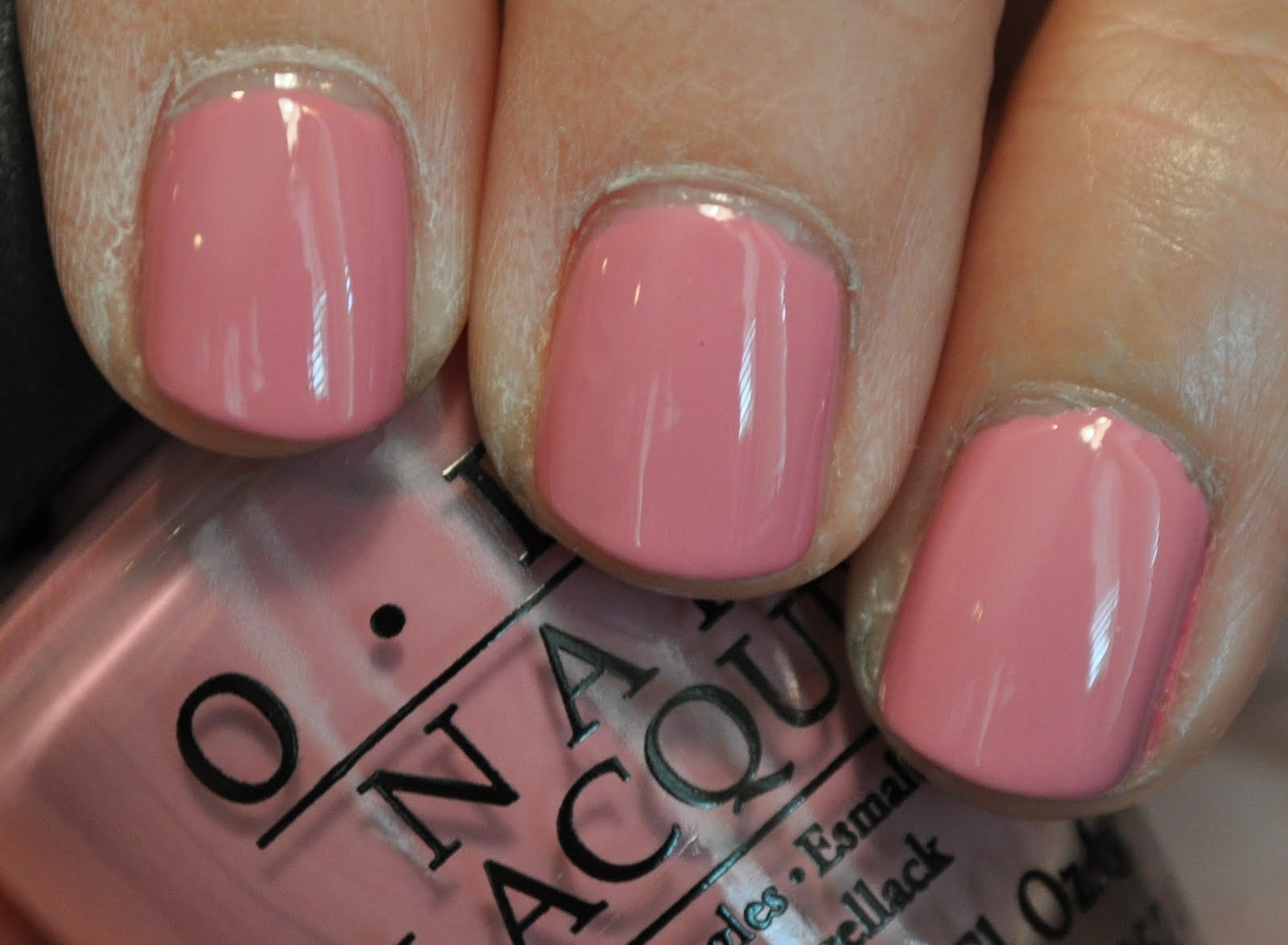
Cracked Medallion is a bronze crackle. Here I have it layered over Zoya's Tamsen. I love the color combo, but I think I didn't wait long enough for my polish to dry, because only one finger cracked really well, much to my disappointment. I am going to show one picture like usual, but then I'll just show you close ups of the finger that did crack really well.


See what I mean? I still think it looks kind of cool, even though it didn't crack properly, but I was still disappointed.

Artificial light:

Artificial light with flash:

Natural light - shade:

Natural light - sun:

I think this is a lot of fun, I think I just needed to wait longer to apply the crackle polish, because it definitely did not crackle the way I have seen it crackle on other blogs. Boo!

Next up is 
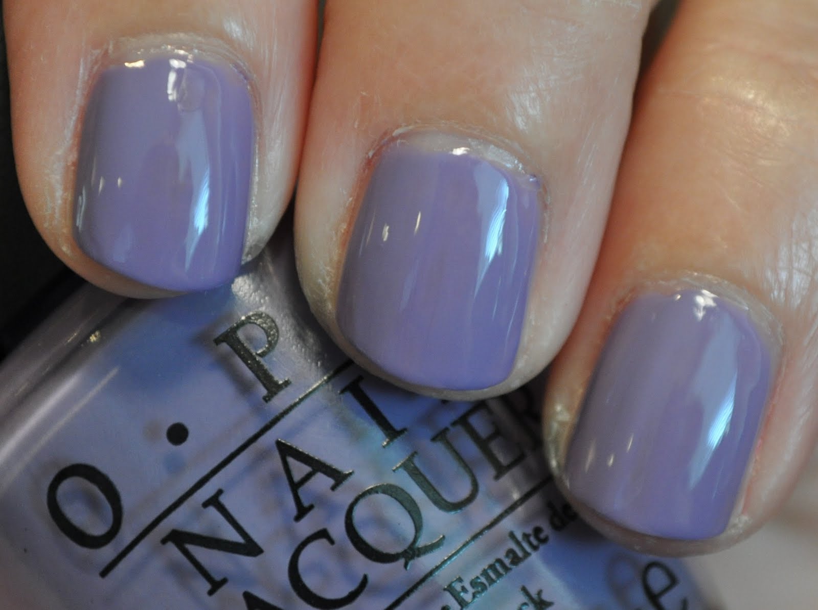
Tarnished Gold, a crackle I have really been looking forward to. As the name suggests, this is a metallic gold crackle. I like this gold because it seems to fall pretty squarely in the "gold" category-- not too pale, and not too green/bronze. A nice medium yellow gold. Here I have layered it over Zoya's Mira, mainly because purple and gold are the colors of my alma mater, and I am hoping to break out some combinations of this during football season this fall! (Only 6ish weeks away!) Unfortunately, I had the same problems with this that I did with Cracked Medallion, and it didn't crack really well, except on one finger. The effect is kind of cool, but not really what I was going for.


Again, it's cool, but not really the look I was going for, which was a bummer.

Artificial light:

Artificial light with flash:

Natural light - shade:

Natural light - sun:

I think this looks cool and has potential-- just wish it had cracked better here. But I will do some more playing around with it and see how it goes!